Very Peri
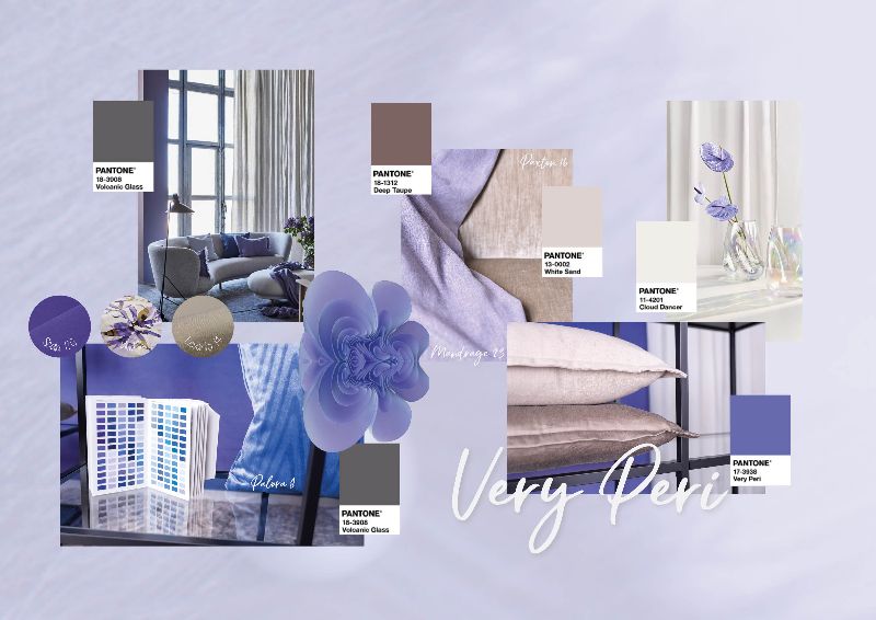
This month, our stylists have created a three dimensional display with focus on the Pantone Colour of the year – Very Peri. Veri Peri is a dynamic periwinkle blue hue with a vivid violet red undertone, and is called the happiest and warmest shade of blue by Pantone.
“Encompassing the qualities of the blues, yet at the same time possessing a violet-red undertone, PANTONE 17-3938 Very Peri displays a spritely, joyous attitude and dynamic presence that encourages courageous creativity and imaginative expression.” – Pantone.
Veri Peri infuses a sense of playful freshness into interiors and can lead to creative colour combinations. It is a perfect accent colour that works for all seasons to add a splash of colour and serves as visual uplifter to an interior.
Colour Palette:
We have combined this vibrant colour with various shades of natural tones of beige and taupe to highlight the effect of this colour in a natural palette, resulting in a creatively bold yet playful and sensuous combination.
Very Peri accents:
To avoid an overwhelming presence of this bold colour, one of the best ways to use Very Peri would be as an accent color – on rugs, cushions, quilt covers, vases. An accent wall can also work as a great backdrop. In bedrooms bring this colour in the headboard or bed linens.

Introduce Statement Furniture:
This colour is great to add a pop of colour on a statement furniture piece. Due to its blue base, the color has a sense of comfort and tranquillity that works perfectly with soft furnishing.

The right colour palette and lighting:
This hybrid colour’s undertones can reflect differently to different lights and it is best to first decide the total colour palette and check it in natural light and the lighting in the room. As a vibrant warm tone, it will pair well with natural tones like white, soft tones of sand, beige and taupe as well as other accent tones such as shades of green, blue and even pink and orange.

